The design of Masters of the Universe is one of the film's best qualities. The production did well to hire Claudio Mazzoli as a concept artist and William Stout as production designer. They did a good job of bringing Eternia to life on a small budget.
Castle Grayskull is really transformed from its original design. I love the epic scale of the building but somehow it is less grand that its animated counterpart.
This is concept artwork by Mazzoli for the Grayskull throne room.
This is concept art for the throne room by Stout.
In the final film you can see a fusion of ideas from both great pieces. Though it's a great set I don't think it feels like it belongs in the castle. The exterior and interior don't seem to mesh very well.
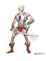
This black and white sketch is a concept for He-Man by Moebius. I think it updates the character nicely. It gives him a bit of a gladiatorial feel. The colour sketch is by Claudio Mazzoli and clearly hearkens back to the animated He-Man. It's very flashy and He-Man appears younger and leaner.The final sketch is by William Stout. He successfully combines the best elements of the other two sketches. This sketch bears a great resemblance to the final realized appearance of Dolph Lundgren as He-Man.
The designers were clearly careful to respect the original animated series and yet, not afraid to make some changes for the translation to live action. I really would like to have seen what they would have done with more money. This could have been a huge sci-fi/fantasy blockbuster!
A great source for more information and artwork is He-Man.org.
A great source for more information and artwork is He-Man.org.


No comments:
Post a Comment